
In today’s information-overloaded world, how do you make sure your message gets noticed? The answer lies in infographics. These visual tools are a powerful way to display data in a way that’s engaging, easy to understand, and memorable. Whether you’re presenting statistics, processes, or comparisons, infographics can turn complex information into a clear and compelling story.
Why are infographics so effective? First, they’re visually appealing. Humans are naturally drawn to visuals, and a well-designed infographic can capture attention much faster than a wall of text. Second, they simplify complexity. By using charts, icons, and concise text, infographics make it easier for your audience to grasp key points quickly.
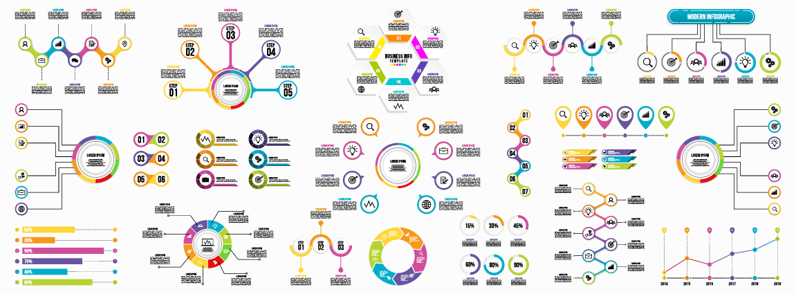
To create great infographics, start with a clear focus. What’s the one key message you want to convey? Avoid overloading the design with too much information. Use visual elements like colour, icons, and charts strategically to highlight important data. For example, a pie chart might show percentages clearly, while an icon can represent a specific concept in an easily digestible format.
Finally, align your infographic design with your brand style. Consistency in fonts, colours, and overall aesthetic helps reinforce your business identity. Whether you’re sharing your infographic on social media, in a presentation, or as part of a report, professional design ensures it’s both informative and impactful.
Don’t let your data get lost in the shuffle. With the right design, your information can stand out, captivate your audience, and drive your message home.